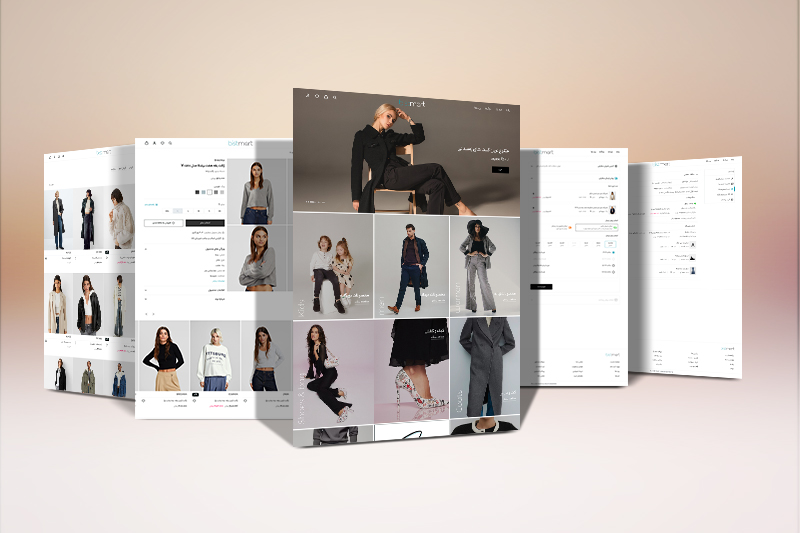
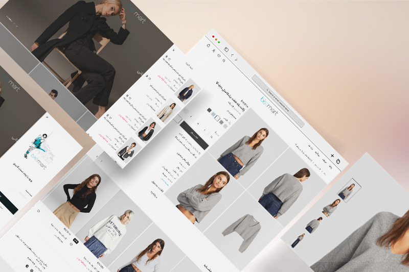
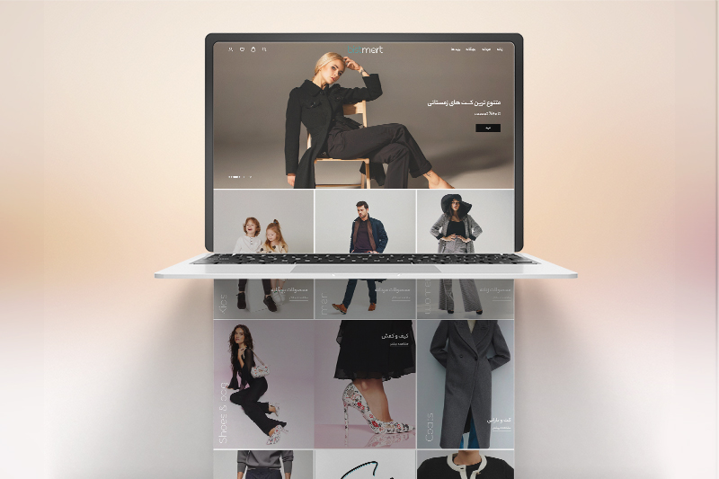
Bistmart Website
Website
Overview of project
Description
Bistmart is more than just another fashion e-commerce platform; it’s an innovative fusion of cutting-edge technology and stylish convenience. Designed with user experience at its core, Bistmart seamlessly merges the latest fashion trends with an intuitive, streamlined shopping process. This project focuses on tackling user pain points by enhancing every step of the shopping journey, ensuring a smooth and enjoyable experience. Featuring a multi-brand shopping experience, Bistmart brings together the best in fashion, making shopping not only easier but truly enjoyable.
In addition, we designed Bistmart as a Progressive Web App (PWA) and desktop version, ensuring seamless accessibility and a modern, responsive experience across all devices.
-
Start Date:
Apr 2024 -
Final Date:
May 2024 -
Status:
Completed -
Company:
Ayria -
Location:
Tehran-Iran
Problem statements
- Frustrating Browsing Experience: If users can't easily browse or search for products, they might get frustrated and abandon the site.
- Sizing Issues: Finding the right size online is tough, leading to returns and exchanges that are time-consuming and frustrating.
- Impersonal Experience: Users might feel the experience is impersonal and struggle to find products that suit their needs.
- Cart Abandonment: A complicated checkout process can lead to higher cart abandonment rates and reduced customer satisfaction.
- Mobile Usability: Poor mobile usability can frustrate users shopping on their phones, affecting conversions.
- Complex Filtering: Users could have a hard time finding products that match multiple criteria, reducing satisfaction and possibly leading to site abandonment.
- Reapplying Filters: Users may have to reapply filters or start their search again, leading to frustration and lower conversion rates.
What we did
- Making Browsing a Breeze: We created a user-friendly category hierarchy and improved search filters based on price, brand, and ... Plus, now you can see how many products are left after applying each filter, so no more frustration!
- No More Sizing Guesswork: To tackle sizing issues, we included detailed size guides and product descriptions. This means fewer returns and a better shopping experience.
- Personal Touch: We added smart recommendation algorithms that suggest products based on your browsing history, past purchases, and preferences. This makes shopping feel more personal and tailored to you.
- Smooth Checkout: We simplified the checkout process, reducing the steps needed and adding clear calls-to-action like “Proceed to Checkout” or “Confirm Order”. This helps reduce cart abandonment and keeps customers happy.
- Mobile Magic: Our PWA design is super mobile-friendly with touch-friendly interfaces, larger buttons, and easy navigation. Shopping on your phone has never been this smooth.
- Easy Filtering: Now, you can select multiple filters at once, like brands, colors, and sizes. Finding the perfect product is easier and more satisfying.
- Sort It Out: We provided clear sorting options such as "Price: Low to High," "Top Rated," and "New Arrivals" so users don’t have to reapply filters or start their search all over again.
Achievements
- Making Browsing Enjoyable: Created a clear and user-friendly category system and improved search filters, making it easy and frustration-free for users to find what they’re looking for.
- Nailing the Fit: Introduced detailed size guides and thorough product descriptions, which significantly cut down on returns and exchanges, making shopping smoother for everyone.
- Personal Shopping Assistant: Developed advanced recommendation algorithms to offer personalized product suggestions, making the shopping experience feel more tailored and enjoyable.
- Checkout Simplified: Streamlined the checkout process by cutting down unnecessary steps and adding clear calls-to-action, which reduced cart abandonment and boosted customer satisfaction.
- Mobile Shopping, Made Easy: Ensured our PWA design was mobile-friendly, with touch-friendly interfaces, larger buttons, and simplified navigation, enhancing the shopping experience on smartphones.
- Easy and Effective Filtering: Enabled users to apply multiple filters across different attributes, making it simpler for them to find exactly what they want and improving overall satisfaction.
- Smart Sorting Options: Provided clear sorting options like "Price: Low to High," "Top Rated," and "New Arrivals," so users don’t have to reapply filters or restart their search.


